These two sliders can cause a lot of confusion for Lightroom users. They are right next to each other and both affect the color intensity in your image.
However, knowing the difference between them can improve your results significantly.
The main difference between vibrance and saturation is that saturation adjusts the intensity of all colors in the image equally and vibrance will do the same but avoid increasing the color intensity of the most saturated areas, avoid decreasing the intensity of the least saturated areas, and protect the skin tones in your image.
So basically, vibrance is a smarter, more targeted version of the saturation adjustment.
What Is Saturation In Lightroom?
Saturation in Lightroom adjusts the intensity of the colors. As the saturation of color increases the color becomes more “pure.”
It is a strong adjustment that affects all the colors in the image equally. Adobe calls it an “absolute” adjustment because it will affect all colors in an image equally.
Take a look at the color wheel below. The left side is the original image and the right side is the same image with a +100 Saturation adjustment in Lightroom.
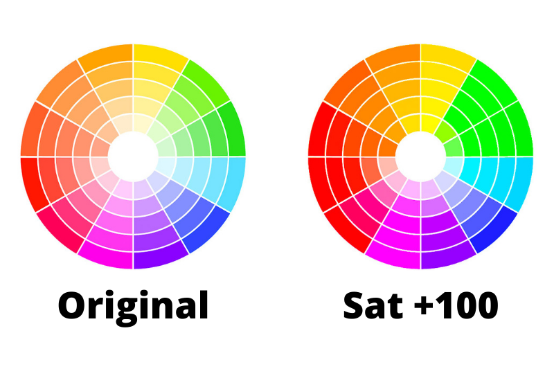
As you can see, every piece of the wheel has increased in saturation by a relatively similar amount.
On the red and orange side of the wheel, it appears that some of the slightly less saturated pieces actually reached maximum saturation with the adjustment and look identical.
Colors can reach a maximum saturation where they are the purest of that hue. In a photo, however, this will obscure details in the image and often look quite bad.
Now check out what a -100 saturation adjustment does to an image.
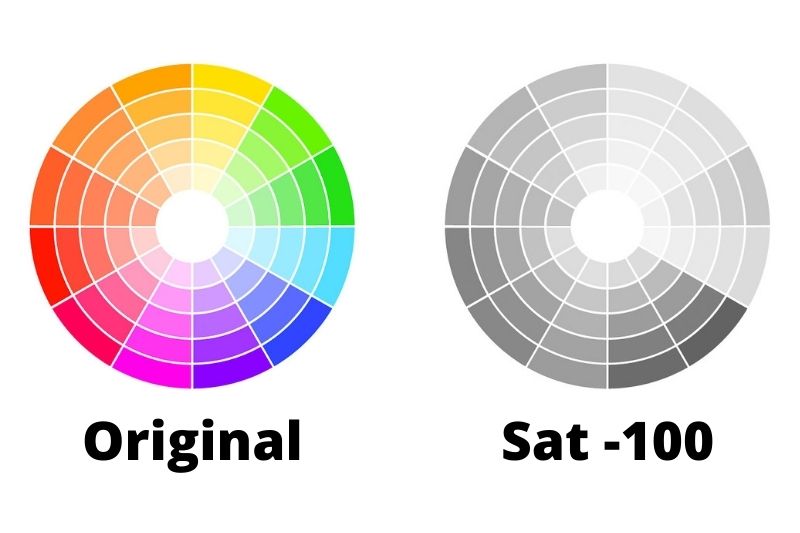
With this adjustment, you are completely removing all color saturation from an image and essentially turning it into a black and white image.
So making this “absolute” change in saturation can have some negative effects on the quality of your image.
That’s where vibrance comes in…
What Is Vibrance in Lightroom?
Vibrance controls the exact same thing that saturation does, the intensity of the colors. However, the way that it differs is that it has sort of a built-in regulator as to which parts of the image it affects and how strongly it affects them.
Lightroom is analyzing your image and controlling what pixels the vibrance slider affects based on the original saturation level of those pixels.
Ok, I know that was a little dense, so I’ll try to break it down a little better.
So the vibrance slider will have a unique effect for every image.
Take a look at the same color wheel again below, this time with a +100 vibrance adjustment.
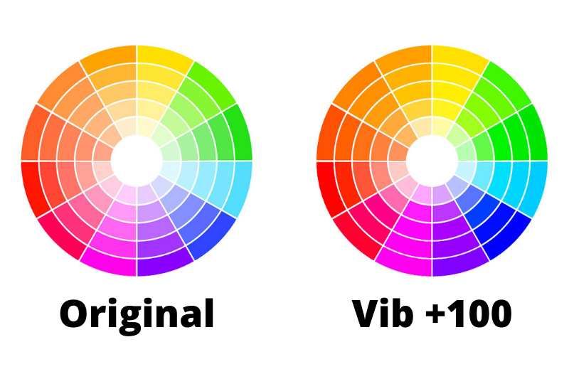
It has a relatively similar effect except for a few key differences.
First, you can see that the overall strength of the adjustment is less. This is because the more a pixel is already saturated, the less the vibrance slider affects it. So those sections halfway between the inside and outside (the medium saturated ones) are less affected by the vibrance slider than the saturation slider.
Also, you can see that the sections on the inner ring on the lower left (the ones closest to skin tones, were hardly affected at all. This is because the vibrance slider protects skin tones from being affected.
Now, let’s look at how negative vibrance works.
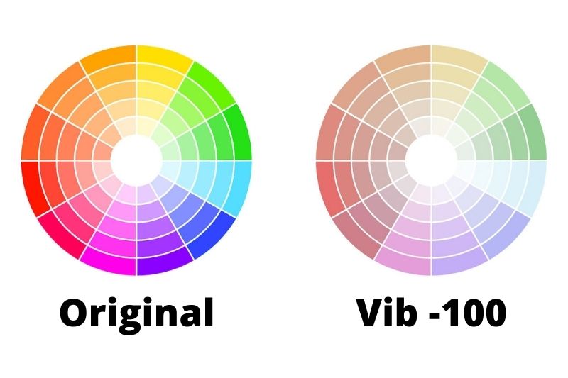
You can see that almost all the sections in the circle have some color left in them at -100 vibrance (compare this to the -100 saturation adjustment above).
The reason for this is that when you reduce vibrance, it has a similar dynamic limit as when you increase it. When reducing vibrance, it will affect the most saturation pixels more than the less saturated pixels.
The effect then, is that once the saturation is reduced to a certain point in a specific pixel, the vibrance slider will have minimal effect on that pixel.
So you can see that many of the sections were reduced in saturation significantly, but didn’t go completely to black and white like they did with the -100 saturation adjustment.
Using Vibrance and Saturation in Portraits
Understanding the differences between these two sliders becomes more important when editing a portrait photo.
Let’s take a look at one. Here is the original photo with minimal adjustments made to it.
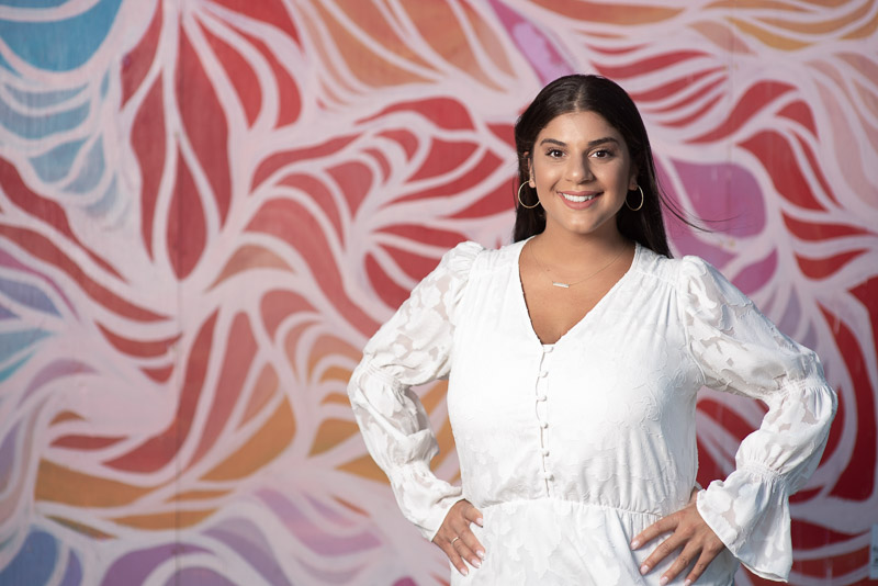
I’m going to make the same +100 adjustments to vibrance and saturation so you can easily see the effects, but generally, you wouldn’t be pushing the adjustments this far.
Here is the image with a +100 saturation adjustment.
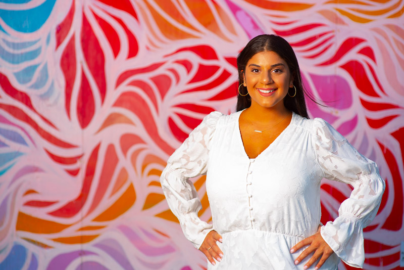
As you can see, increasing the saturation has affected every color in the image, including the face. This gives a quite unnatural look to the skin tone.
Even if I made less of an adjustment, there would still be a big effect on the skin tone that I wouldn’t want.
Now, let’s see how a +100 vibrance adjustment affects this image.
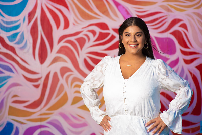
As you can see, the colors in the back are increased a good amount (though a bit less than the saturation slider) BUT the skin tones are significantly less affected.
I might back off a little bit and not use a +100 adjustment with vibrance, but even at that level, the skin tones are well protected from looking completely unnatural.
When Should You Use Saturation?
You can use saturation anytime you want to make significant adjustments to the intensity of all the colors in an image.
But here are a few tips for using saturation.
Use Vibrance First
Because vibrance is a more subtle adjustment, try using it first to see if you can get the look you want in the image.
More often than not, vibrance is all you need and adjusting saturation can cause more harm than good.
For Color Correction…Try Adjusting Each Color Individually
The saturation slider is a global adjustment, so even small changes can have drastic effects on an image.
When you want to color correct an image, it is rare that you will need to lower or raise the saturation on every color. For this, I suggest using the HSL panel and reducing the saturation of the individual color which is having a negative effect on your image.
When Should You Use Vibrance?
Vibrance is a great option for portraits, images that already have areas of high saturation, or any time when you want a more subtle adjustment.
To be honest, it is rare that I use the global saturation slider. I prefer to use the individual color saturation sliders in the HSL panel instead as they give more control over the image.
Is Vibrance Better Than Saturation?
Neither vibrance nor saturation is “better” than the other one. However, the vibrance slider is “smarter” because it avoids oversaturating pixels that are already saturated as well as skin tones whereas saturation affects all pixels equally.
So the choice of which to use will depend on what you need to accomplish in your image.
Using Vibrance and Saturation Together
Here is my workflow for adjusting the saturation of colors in my image.
I’ll use the individual color saturation sliders first to do any color correction in an image.
After that, if the image needs a little more color intensity overall, I will use the vibrance slider to add that, knowing that it is much less likely to oversaturate the colors in the image.
For example, in the portrait image above, I decreased the yellow saturation in the image because it was shot at sunset and her skin looked much too yellow to start. Then I could make the vibrance adjustment to increase the background colors.